Student Spotlights
Studio Art
Professor Hiromi Okumura partnered on a mural project with Pyramid Healthcare in Radford, VA. The project started in the summer of 2023 and was completed in the spring of 2024. Hiromi recruited a small group of students who worked on the murals weekly. Students from across disciplines collaborated on the entire process. For two months, the students learned about Pyramid Healthcare and brainstormed concept ideas. Once Pyramid approved the designs, they started painting.

Samantha Gonclaves Huskey, a civil engineering major, remarked, "What surprised me the most was the meaningfulness behind each part of the mural."
It was important for the team to reflect the beauty of the surrounding environment. They called on inspiration from the New River, the Blue Ridge Mountains, and even incorporated "Big Foot" because a resident asked.
"It was very fun and low stress," Michah Darden, a civil engineering major said. "Hiromi always would say if you make a mistake you can paint over it. I feel like that helped with anxiety of making a mistake especially when your painting over portions of the mural that already look amazing."


Emma Burnett, an art history major, commented, "The process was rather therapeutic, there wasn’t too much pressure but we were all still doing our best to work together to create something cohesive and readable. I really enjoyed spending time with classmates and Hiromi herself outside of class in a casual setting focused on a common goal."

Alyssa Sanders, a creative technologies major said, "I was surprised by how easily the mural came together and how beautiful the final product was, despite so many people of varying skill levels working on it, and for many of us, it was our first time painting on such a large scale. Everyone did a really great job, and I’m proud I got to work on a project with such amazing artists."
The murals are about hope, gratitude, and the journey of recovery.

Graphic Design
Q&A with Milana Slowinski
As a graphic design student, I love the versatility and creativity that graphic design allows. I often point out the fact that most of what we see in the world around us was made by a graphic designer. I'm drawn to graphic design because of its dual nature, blending precise, technical elements with the creative challenge of communicating messages through innovative visuals. I transferred to Virginia Tech from a university in Poland, where I studied International Relations, and since then, I have never doubted that studying graphic design was my calling. In a modern and increasingly visual world, the career prospects and demand for graphic designers are ever-expanding, underlining their indispensable role in today’s society.
One of the most rewarding aspects of graphic design is seeing my work come to life. Whether it's a poster, a website, or a logo for a conference, seeing how my designs can make a positive impact or resonate with others is incredibly fulfilling. Overall, I love how graphic design allows me to blend artistry with functionality, and I'm excited to continue exploring and creating in this field and hopefully continue to leave a mark on the world.
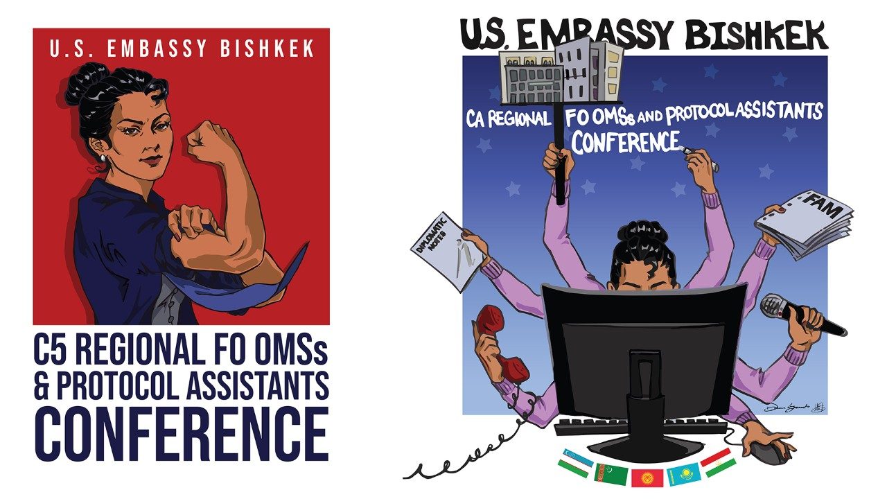
Growing up in a family of American diplomats has provided me with some extraordinary opportunities, including collaborating with U.S. Embassies in six different countries. My most recent and likely most memorable opportunity was at the U.S. Embassy in Bishkek, Kyrgyzstan. My mother, currently stationed there as an Office Management Specialist (OMS), approached both my sister and I in mid-March about designing some graphics and visual branding for an upcoming conference at the Embassy. This conference, the Central Asian Regional Conference for Foreign Service Executive Office Management Specialists and Protocol Assistants, aimed to recognize and appreciate the often-overlooked front office employees for their crucial contributions. Additionally, the event allowed them to go over their craft and get more professional training, and improve communication with each other. These individuals form the backbone of successful embassy operations worldwide, and this conference specifically aimed to spotlight those in the Central Asian region. Confident in my abilities, my mother assigned me the task of overseeing the logos for the event. I worked closely with my sister under her watch and did my best to help her vision come to life.
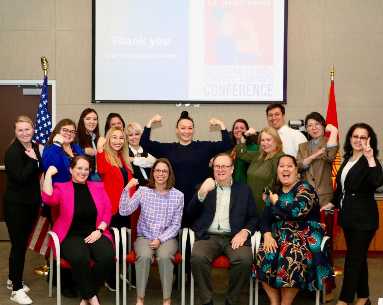
The conference turned out to be a big hit! The event was recognized by the Deputy Assistant Secretary of State, who welcomed everyone via a video message. Now the conference is called the Bishkek model and other posts in different countries are asking for it. The US Embassy in Bishkek was the first to have its own logos.
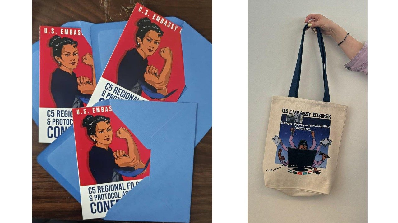
The masterminds behind these logos were definitely my mother and sister. My mother came to us with her vision—portraying the front office employees, who are often women, as strong, independent, and multi-faceted leaders. My mother wanted the face of the conference to be inspired by the many Central Asian women she works alongside. She requested two separate graphics, one to use as the general logo for the conference and one to use as a secondary illustration-based design for pieces of merch. My sister took on the task of digitally illustrating the basis for each logo. The color direction, character design, and general compositions were all requested by our mother. She really wanted some aspects of a comic-like superhero to come through in the designs, hence the red and blue logo with the muscular woman. The colors were pulled from the American flag and the Kyrgyz flag, all the while still subtly referencing superheroes like Superman. We both sketched out ideas for each logo and came up with the respective designs. My sister sent multiple drafts throughout the week and tweaked details according to my mother's liking. We tried not to let our own artistic opinions interfere with what the client truly wanted; despite the difficulty of compromise, it taught us both an important lesson about working with clients and striving to honor the client's vision.
After about a week of my sister working on the illustrations, I imported the illustrations into Adobe Illustrator to vectorize them, add the typography, and mold them into more successful logos. I went through about 20 different iterations of logomarks, font choices, title placement, and much more. Working with such a specific request and a rather long conference title proved to be a challenge. My mother really wanted a hand-written quality of the typography in the second illustrative logo, so my sister actually handwrote the conference name. This logo was also inspired by the many tasks that front office specialists face, hence the multiple arms and sunrise behind the character, symbolizing working tirelessly from dawn to dusk. Ultimately, the final products were tailored to fit the client's direct requests. However, I still strove to incorporate as much of my structural graphic design knowledge without obscuring the intended final product. Many of my drafts proposed structural typographic layouts, unique fonts, strategic text placement, and color corrections. I then prepared the final files to be sent off to the local printing companies in Bishkek that produced the merchandise. In short, my sister and I had a week to create these graphics, and we created exactly what my mother, our client, had requested and envisioned.
As a Virginia Tech student, Ut Prosim is a guiding principle that embodies selflessness, compassion, and a commitment to making a positive impact on others and the world. It has become completely ingrained in my values as both a student and a person. To me, it signifies a mindset of looking beyond oneself and striving to use one's skills, abilities, and resources to benefit others and contribute to the greater good.
In the context of this conference and my role in it, Ut Prosim emphasizes the importance of service, community involvement, and recognition for the diligent individuals often underappreciated at U.S. embassies. It was a privilege to work with my mother and the U.S. embassy by applying my graphic design skills, fostered by Tech's graphic design program, to create the conference's visual identity. These graphics exist as a direct acknowledgment and thank you to the attendees, and hearing about the positive reception was well worth all the effort. The conference will now be recurring yearly to continue to recognize the remarkable people that make up the front office and provide them with higher quality training.


.jpeg.transform/xl-medium/image.jpg)
